- CSS - Home
- CSS - Roadmap
- CSS - Introduction
- CSS - Syntax
- CSS - Inclusion
- CSS - Types
- CSS - Measurement Units
- CSS - Selectors
- CSS - Colors
- CSS - Backgrounds
- CSS - Fonts
- CSS - Text
- CSS - Images
- CSS - Links
- CSS - Tables
- CSS - Borders
- CSS - Border Block
- CSS - Border Inline
- CSS - Margins
- CSS - Lists
- CSS - Padding
- CSS - Cursor
- CSS - Outlines
- CSS - Dimension
- CSS - Scrollbars
- CSS - Inline Block
- CSS - Dropdowns
- CSS - Visibility
- CSS - Overflow
- CSS - Clearfix
- CSS - Float
- CSS - Arrows
- CSS - Resize
- CSS - Quotes
- CSS - Order
- CSS - Position
- CSS - Hyphens
- CSS - Hover
- CSS - Display
- CSS - Focus
- CSS - Zoom
- CSS - Translate
- CSS - Height
- CSS - Hyphenate Character
- CSS - Width
- CSS - Opacity
- CSS - Z-Index
- CSS - Bottom
- CSS - Navbar
- CSS - Overlay
- CSS - Forms
- CSS - Align
- CSS - Icons
- CSS - Image Gallery
- CSS - Comments
- CSS - Loaders
- CSS - Attr Selectors
- CSS - Combinators
- CSS - Root
- CSS - Box Model
- CSS - Counters
- CSS - Clip
- CSS - Writing Mode
- CSS - Unicode-bidi
- CSS - min-content
- CSS - All
- CSS - Inset
- CSS - Isolation
- CSS - Overscroll
- CSS - Justify Items
- CSS - Justify Self
- CSS - Tab Size
- CSS - Pointer Events
- CSS - Place Content
- CSS - Place Items
- CSS - Place Self
- CSS - Max Block Size
- CSS - Min Block Size
- CSS - Mix Blend Mode
- CSS - Max Inline Size
- CSS - Min Inline Size
- CSS - Offset
- CSS - Accent Color
- CSS - User Select
- CSS - Cascading
- CSS - Universal Selectors
- CSS - ID Selectors
- CSS - Group Selectors
- CSS - Class Selectors
- CSS - Child Selectors
- CSS - Element Selectors
- CSS - Descendant Selectors
- CSS - General Sibling Selectors
- CSS - Adjacent Sibling Selectors
- CSS Advanced
- CSS - Grid
- CSS - Grid Layout
- CSS - Flexbox
- CSS - Visibility
- CSS - Positioning
- CSS - Layers
- CSS - Pseudo Classes
- CSS - Pseudo Elements
- CSS - @ Rules
- CSS - Text Effects
- CSS - Paged Media
- CSS - Printing
- CSS - Layouts
- CSS - Validations
- CSS - Image Sprites
- CSS - Important
- CSS - Data Types
- CSS3 Advanced Features
- CSS - Rounded Corner
- CSS - Border Images
- CSS - Multi Background
- CSS - Color
- CSS - Gradients
- CSS - Box Shadow
- CSS - Box Decoration Break
- CSS - Caret Color
- CSS - Text Shadow
- CSS - Text
- CSS - 2d transform
- CSS - 3d transform
- CSS - Transition
- CSS - Animation
- CSS - Multi columns
- CSS - Box Sizing
- CSS - Tooltips
- CSS - Buttons
- CSS - Pagination
- CSS - Variables
- CSS - Media Queries
- CSS - Functions
- CSS - Math Functions
- CSS - Masking
- CSS - Shapes
- CSS - Style Images
- CSS - Specificity
- CSS - Custom Properties
- CSS Responsive
- CSS RWD - Introduction
- CSS RWD - Viewport
- CSS RWD - Grid View
- CSS RWD - Media Queries
- CSS RWD - Images
- CSS RWD - Videos
- CSS RWD - Frameworks
- CSS References
- CSS Interview Questions
- CSS Online Quiz
- CSS Online Test
- CSS Mock Test
- CSS - Quick Guide
- CSS - Cheatsheet
- CSS - Properties References
- CSS - Functions References
- CSS - Color References
- CSS - Web Browser References
- CSS - Web Safe Fonts
- CSS - Units
- CSS - Animation
- CSS Resources
- CSS - Useful Resources
- CSS - Discussion
CSS Cheat Sheet
CSS stands for Cascading Style Sheets, fondly referred to as CSS, is a simple design language intended to simplify the process of making web pages presentable.
What is CSS Cheat Sheet?
CSS cheat sheet is a collection of all the CSS properties and selectors that can be used to design any website. In this sheet we will provide mostly used CSS properties and related code snippets of below listed topics.
Table of Content
Basics of CSS
CSS specify how an HTML element should be displayed on the web page. If you think of the human body as a web page then CSS is styling part of the body. Like color of the eyes, size of the nose, skin tone, etc.
Syntax
selector { property: value; }
Ways to use CSS
There are three ways to use CSS into your HTML document.
- Inline CSS: Inline CSS are directly applied on the HTML elements using style attribute.
- Internal CSS: Internal CSS are defined in the HTML head section inside of <style> tag to let the browser know where to look for the CSS.
- External CSS: External CSS are defined in a separate file that contains only CSS properties, this is the recommended way to use CSS when you are working on projects.
CSS Selectors
CSS Selectors are used to select the HTML elements you want to style on a web page. They allow you to target specific elements or groups of elements to apply styles like colors, fonts, margins, and more.
Universal Selectors
It is used to select all elements of the HTML.
* {
    color: blue;
}
Element Selectors
This is used to select particular HTML elements like p, span, header, etc.
div {
    border: 5px inset gold;
}
Class Selectors
This is used to select class defined by your own.
.myClass {
    background-color: #04af2f;
}
Id Selectors
This is used to select id defined by your own.
.myId {
    background-color: #04af2f;
}
Attribute Selectors
This is used to select particular HTML attributes.
a[href] {
    font-size: 2em;
}
Group Selectors
This is used to select multiple elements and style them together.
h3,h4 {
    text-align: center;
}
Pseudo-element Selectors
This is used to select Pseudo-element.
p::before {
    content: "Note: ";
    font-weight: bold;
}
Pseudo-class Selectors
This is used to select Pseudo-class.
a:hover {
    background-color: peachpuff;
}
Descendant Selectors
This is used in css to style all the tags which are child of a particular specified tag.
div p {
    color: blue;
}
Child Selectors
This is used to select all the direct child of a particular element.
div>p {
    color: blue;
}
Adjacent Sibling Selectors
This is used to select an element that is immediately preceded by a specified element.
div + p {
    color: blue;
}
General Sibling Selectors
This is used to select all the element that is preceded by a specified element.
div~p {
    color: blue;
}
Font Properties
CSS Font is a set of text characters with a consistent design and style. It includes the shape, size, weight, and other attributes of the characters in a typeface.
font
Shorthand font property.
p {
    font: oblique small-caps
          bold 20px Arial, sans-serif;
}
font-family
CSS font-family specifies the font family or list of font families to be used for text.
#para1 {
    font-family: verdana, georgia;
}
font-feature-settings
CSS font-feature-settings controls advanced typographic features in OpenType fonts.
p {
    font-feature-settings: 'smcp', off;
}
font-kerning
CSS font-kerning determines the way specific pairs of letters are spaced.
#nokern {
    font-kerning: none;
}
font-language-override
CSS font-language-override Overrides the typeface behavior for a particular language.
.text {
    font-language-override: "DAN";
}
font-optical-sizing
CSS font-optical-sizing sets whether rendering of text should be optimized to view at different sizes.
.myDiv {
    font-optical-sizing: auto;
}
font-palette
CSS font-palette allows the usage of one of the various palettes that are contained in a font.
font-palette: normal | light | dark | <palette-name> | <integer>;
font-size
CSS font-size sets the size of the text.
font-size: medium | xx-small | x-small | small | large | x-large | xx-large | smaller | larger | length | percentage | initial | inherit;
font-size-adjust
CSS font-size-adjust specifies a font's aspect value (numeric ratio) that controls its x-height.
font-size-adjust: number|none|initial|inherit;
font-stretch
CSS font-stretch adjusts the width of the text (condensed or expanded).
font-stretch: ultra-condensed | extra-condensed | condensed | semi-condensed | normal | semi-expanded | expanded | extra-expanded | ultra-expanded | percentage | initial | inherit;
font-style
CSS font-style specifies the style of the text, such as "italic", "oblique", or "normal".
font-style: normal | italic | oblique | initial | inherit;
font-weight
CSS font-weight sets the thickness or boldness of the text.
font-weight: normal | bold | bolder | lighter | number | initial | inherit;
font-synthesis
CSS font-synthesis is a shorthand font-synthesis property.
font-synthesis: none | weight | style | small-caps | position | initial | inherit;
font-synthesis-small-caps
CSS font-synthesis-small-caps determines whether or not the browser should synthesize the small-caps typeface, that is missing in a font-family.
font-synthesis-small-caps: auto | none | initial | inherit;
font-synthesis-style
CSS font-synthesis-style determines whether or not the browser should synthesize the oblique typeface, that is missing in a font-family.
font-synthesis-style: auto | none | initial | inherit;
font-synthesis-weight
CSS font-synthesis-weight determines whether or not the browser should synthesize the bold typeface, that is missing in a font-family.
font-synthesis-weight: auto | none | initial | inherit;
font-variant
CSS font-variant controls the use of small caps for lowercase letters in the text.
font-variant: normal|small-caps|initial;
font-variant-alternates
CSS font-variant-alternates controls the usage of alternate glyphs.
font-variant-alternates: normal | historical-forms | stylistic() | styleset() | character-variant() | swash() | ornaments() | annotation();
font-variant-caps
CSS font-variant-caps controls the usage of alternate glyphs for capital letters.
font-variant-caps: normal|small-caps|all-small-caps|petite-caps|all-petite-caps|unicase|titling-caps|initial|inherit|unset;
font-variant-east-asian
CSS font-variant-east-asian controls the usage of alternate glyphs for East-Asian scripts like Chinese and Japanese.
font-variant-east-asian: normal | ruby;
font-variant-ligatures
CSS font-variant-ligatures controls the textual content of element as to which ligature or contextual form should be used.
font-variant-ligatures: normal | none | <common-lig-values>" | <discretionary-lig-values> | <historical-lig-values> | <contextual-alt-values>;
font-variant-numeric
CSS font-variant-numeric controls the usage of alternate glyphs for numbers, fractions and ordinal markers.
font-variant-numeric: normal | ordinal | slashed-zero | lining-nums | oldstyle-nums | proportional-nums | tabular-nums | diagonal-fractions | stacked-fractions;
font-variant-position
CSS font-variant-position controls the usage of alternate, smaller glyphs, positioned as superscript or subscript.
font-variant-position: normal | sub | super;
font-variation-settings
CSS font-variation-settings specifies the four-letter axis names of variable font characteristics.
font-variation-settings: normal | <string><integer>;
Text Properties
A text refers to a piece of written or printed information in the form of words or characters that can be read and understood. Texts can include content such as books, articles, emails, messages, web pages, etc.
Styling a text involves modifying its appearance to make it more visually appealing or to convey a particular message. This chapter demonstrates how to manipulate text using CSS properties.
color
CSS color sets the color of an element.
color: color | initial | inherit;
direction
CSS direction defines direction of the flow of an element's content.
direction: ltr | rtl | initial | inherit;
line-height
CSS line-height sets the distance between adjacent text baselines.
line-height: normal | length | number | percentage | initial | inherit;
text-align
CSS text-align sets the text alignment style for an element.
text-align: left | right | center | justify | initial | inherit;
text-decoration
CSS text-decoration defines any decoration for the text; values may be combined.
text-decoration: none | underline | overline | line-through | blink | initial | inherit;
text-indent
CSS text-indent defines the indentation of the first line of text in an element; default is 0.
text-indent: length | percentage | initial | inherit;
text-shadow
CSS text-shadow creates text drop shadows of varying colors and offsets.
text-shadow: <h-shadow><v-shadow> blur-radius color | none | initial | inherit;
text-transform
CSS text-transform transforms the text in the element accordingly.
text-transform: none | capitalize | uppercase | lowercase | full-width | full-width-kana | unset | initial | inherit;
vertical-align
CSS vertical-align sets the vertical positioning of an element.
vertical-align: baseline | sub | super | top | text-top | middle | bottom | text-bottom | length | percentage | initial | inherit;
white-space
CSS white-space defines how whitespace within an element is handled.
white-space: normal | nowrap | pre | pre-wrap | pre-line | break-spaces | initial | inherit;
word-spacing
CSS word-spacing inserts additional space between words.
word-spacing: length | normal | initial | inherit;
Padding Properties
CSS padding defines the space between an element's content and its border.
padding
CSS padding is a shorthand for all padding properties. We can set padding for all four sides using padding shorthand property.
padding: padding-top padding-right padding-bottom padding-left | auto | initial | inherit;
padding-top
CSS Padding-Top sets the width of the padding on the top of an element.
padding-top: length | percentage | auto;
padding-right
CSS Padding-Right sets the width of the padding on the right of an element.
padding-right: length | percentage | auto;
padding-bottom
CSS Padding-Bottom sets the width of the padding on the bottom of an element.
padding-bottom: length | percentage | auto;
padding-left
CSS Padding-Left sets the width of the padding on the left of an element.
padding-left: length | percentage | auto;
Margin Properties
CSS margin property is used to create space around an element, outside of its border.
margin
CSS Margin property is a shorthand property for defining values of properties: margin-top, margin-right, margin-bottom and margin-left in one single statement
margin: margin-top margin-right margin-bottom margin-left | auto | initial | inherit;
Margin-Top
CSS margin-top sets the space outside the element's top border.
margin-top: length | percentage | auto;
Margin-Right
CSS margin-right sets the space outside the element's right border.
margin-right: length | percentage | auto;
Margin-Bottom
CSS margin-bottom sets the space outside the element's bottom border.
margin-bottom: length | percentage | auto;
Margin-Left
CSS margin-left sets the space outside the element's left border.
margin-left: length | percentage | auto;
Background Properties
CSS background properties are used to manipulate the background of elements. It can be used to apply a single background image or multiple background images, as well as defining the background color, size, position, repeat behavior, and other related properties.
background
CSS background is shorthand for background-related properties.
background: color | image | position | size | repeat | attachment | origin | clip | initial | inherit;
background-attachment
CSS background-attachment specifies the position of the background relative to the viewport, either fixed or scrollable.
background-attachment: scroll | fixed | local | initial | inherit;
background-clip
CSS background-clip controls how far a background image extends beyond the element's padding or content box.
background-clip: border-box | padding-box | content-box | initial | inherit;
background-color
CSS background-color sets the background color of an element.
background-color: color | transparent | initial | inherit;
background-image
CSS background-image sets one or more background image(s) on an element.
background-image: url(imageURL) | none | initial | inherit;
background-origin
CSS background-origin sets the origin of the background.
background-origin: border-box | padding-box | content-box | initial | inherit;
background-position
CSS background-position sets the initial position of each image in a background.
background-position: value | initial | inherit;
Note: The values are: <left top, left center, left bottom, right top, right center, right bottom, center top, center center, and center bottom>, <x% y%>, and <xpos ypos>.
background-position-x
CSS background-position-x sets the initial horizontal position of each image in a background.
background-position-x: left | center | right | length | percentage | initial | inherit;
background-position-y
CSS background-position-y sets the initial vertical position of each image in a background.
background-position-y: top | center | bottom | length | percentage | initial | inherit;
background-repeat
CSS background-repeat controls the repetition of an image in the background.
background-repeat: repeat | repeat-x | repeat-y | no-repeat | space | round | initial | inherit;
background-size
CSS background-size controls the size of the background image.
background-size: auto | length | percentage | cover | contain | initial | inherit;
background-blend-mode
CSS background-blend-mode determines how an element's background images blend with each other.
background-blend-mode: normal | multiply | screen | overlay | darken | lighten | color-dodge | color-burn | hard-light | soft-light | difference | exclusion | hue | saturation | luminosity | color | initial | inherit;
Shadow Properties
There are two types of shadow properties existed in CSS as mentioned and described below.
- Text Shadow: This is used to add a shadow effect to text. It allows you to specify the color, offset, blur-radius, and spread-radius of the shadow.
- Box Shadow: This is used to add shadow effect around an element. One or more shadow effects can be added, separated by commas.
text-shadow
CSS text-shadow is used to add a shadow effect to text.
text-shadow: <h-shadow><v-shadow> blur-radius color | none | initial | inherit;
box-shadow
CSS box-shadow is used to add a shadow effect around an element.
box-shadow: none | h-offset v-offset blur spread color | inset | initial | inherit;
Border Properties
Border properties are used to create a border around an element, such as a div, image, or text. It allows you to customize the appearance of the border, including its color, width, and style.
border
CSS border sets all the border properties in one declaration.
border: border-width border-style border-color | initial | inherit;
border-bottom
CSS border-bottom sets the bottom border of an element.
border-bottom: border-width border-style border-color | initial | inherit;
border-bottom-color
CSS border-bottom-color sets the color of the bottom border of an element.
border-bottom-color: color | transparent | initial | inherit;
border-bottom-width
CSS border-bottom-width sets the width of the bottom border of an element.
border-bottom-width: length | thin | medium | thick | initial | inherit;
border-bottom-style
CSS border-bottom-style sets the style of the bottom border of an element.
border-bottom-style: none | solid | dotted | dashed | double | groove | ridge | inset | outset | initial | inherit;
border-color
CSS border-color sets the color of the border of an element.
border-color: color | transparent | initial | inherit;
border-left
CSS border-left sets the left border of an element.
border-left: border-width border-style border-color | initial | inherit;
border-left-color
CSS border-left-color sets the color of the left border of an element.
border-left-color: color | transparent | initial | inherit;
border-left-width
CSS border-left-width sets the width of the left border of an element.
border-left-width: length | thin | medium | thick | initial | inherit;
border-left-style
CSS border-left-style sets the style of the left border of an element.
border-left-style: none | solid | dotted | dashed | double | groove | ridge | inset | outset | initial | inherit;
border-right
CSS border-right sets the right border of an element.
border-right: border-width border-style border-color | initial | inherit;
border-right-color
CSS border-right-color sets the color of the right border of an element.
border-right-color: color | initial | inherit;
border-right-width
CSS border-right-width sets the width of the right border of an element.
border-right-width: length | thin | medium | thick | initial | inherit;
border-right-style
CSS border-right-style sets the style of the right border of an element.
border-right-style: none | solid | dotted | dashed | double | groove | ridge | inset | outset | initial | inherit;
border-style
CSS border-style sets the style of the border of an element.
border-style: none | solid | dotted | dashed | double | groove | ridge | inset | outset | initial | inherit;
border-top
CSS border-top sets the top border of an element.
border-top: border-width border-style border-color | initial | inherit;
border-top-color
CSS border-top-color sets the color of the top border of an element.
border-top-color: color | initial | inherit;
border-top-width
CSS border-top-width sets the width of the top border of an element.
border-top-width: length | thin | medium | thick | initial | inherit;
border-top-style
CSS border-top-style sets the style of the top border of an element.
border-top-style: none | solid | dotted | dashed | double | groove | ridge | inset | outset | initial | inherit;
border-width
CSS border-width sets the width of the border of an element.
border-width: length | thin | medium | thick | initial | inherit;
border-image
CSS border-image sets the border image for an element.
border-image: source slice width outset repeat | initial | inherit;
border-image-outset
CSS border-image-outset sets the image outset (how far the border image area extends beyond the border box).
border-image-outset: length | initial | inherit;
border-image-repeat
CSS border-image-repeat defines whether the border image should be repeated, rounded, spaced, or stretched.
border-image-repeat: stretch | repeat | round | space | initial | inherit;
border-image-source
CSS border-image-source sets the source/path of an image to be used as a border for an element.
border-image-source: image | none | initial | inherit;
border-image-slice
CSS border-image-slice defines how to slice an image for use in a border.
border-image-slice: number | percentage | fill | initial | inherit;
border-image-width
CSS border-image-width sets the width of the image to be used as a border.
border-image-width: length |number | percentage | auto | initial | inherit;
CSS Flexbox
Flexbox organizes elements within a container along a single dimension, which can be either horizontally or vertically aligned.
flex-direction
CSS flex-direction sets the flex direction of the flex items.
flex-direction: row | row-reverse | column | column-reverse | initial | inherit;
flex-wrap
CSS flex-wrap sets whether flex items should wrap onto the next line.
flex-wrap: nowrap | wrap | wrap-reverse | initial | inherit;
justify-content
CSS justify-content sets the alignment of flex items along the main axis.
justify-content: flex-start | flex-end | center | space-between | space-around | space-evenly | initial | inherit;
align-items
CSS align-items sets the alignment of flex items along the cross axis.
align-items: normal | stretch | flex-start | flex-end | center | baseline | initial | inherit;
align-content
CSS align-content sets the alignment and spacing of flex lines within the flex container.
align-content: stretch | flex-start | flex-end | center | space-between | space-around | space-evenly | initial | inherit;
flex-flow
CSS flex-flow sets both the flex-direction and flex-wrap properties.
flex-flow: flex-direction flex-wrap | initial | inherit;
flex-grow
CSS flex-grow sets a flex item to grow within a flex container.
flex-grow: number | initial | inherit;
flex-shrink
CSS flex-shrink sets a flex item to shrink in size to fit the available space.
flex-shrink: number | initial | inherit;
flex-basis
CSS flex-basis sets the initial size of a flex item.
flex-basis: number auto | initial | inherit;
flex
CSS flex is a shorthand property that combines flex-grow, flex-shrink, and flex-basis.
flex: flex-grow flex-shrink flex-basis | auto | initial | inherit;
align-self
CSS align-self sets the alignment of a specific flex item along the cross-axis.
align-self: auto | flex-start | flex-end | center | baseline | stretch | initial | inherit;
order
CSS order is used to specify the order in which flex items appear inside their flex container.
order: number | initial | inherit;
CSS Grid
CSS Grid is a convenient and concise way to define the grid layout of an element.
display
CSS display defines whether an element is a grid container or an inline grid container.
display: grid | inline-grid | initial | inherit;
gap
CSS gap defines the gap between rows and columns.
gap: row-gap column-gap | initial | inherit;
grid-area
CSS grid-area defines the location and size of the grid item within a grid layout.
grid-area: grid-row-start / grid-column-start / grid-row-end / grid-column-end | item name | initial | inherit;
grid-column
CSS grid-column controls the placement of a grid item within the grid container in the column direction.
grid-column: auto | grid-column-start | grid-column-end | initial | inherit;
grid-row
CSS grid-row controls the placement of a grid item within the grid container in the row direction.
grid-row: auto | grid-row-start / grid-row-end | initial | inherit;
grid-template
CSS grid-template specifies the grid columns, grid rows, and grid areas.
grid-template: none | grid-template-rows / grid-template-columns | grid-template-areas | initial | inherit;
grid-auto-columns
CSS grid-auto-columns determines the size of automatically generated grid column tracks or a pattern of such tracks.
grid-auto-columns: auto | length | percentage | max-content | min-content | minmax(min,max) | fit-content() | initial | inherit;
grid-auto-rows
CSS grid-auto-rows determines the size of automatically generated grid row tracks or a pattern of such tracks.
grid-auto-rows: auto | length | percentage | max-content | min-content | minmax(min, max)| fit-content() | initial | inherit;
grid-auto-flow
CSS grid-auto-flow specifies the arrangement of the grid items within the grid.
grid-auto-flow: row | column | dense | row dense | column dense | initial | inherit;
Gradient
CSS Gradients allows to design custom colors for HTML elements by creating a smooth transition between two or more colors.
CSS defines three types of gradients.
Linear Gradient
Goes from left to right, up to down or diagonally.
linear-gradient()
/* to right, black, yellow, green */
Radial Gradient
Start from center to edges.
radial-gradient()
/* circle, black, yellow, green */
Conic Gradient
Revolve around a center point.
conic-gradient()
/* black, yellow, green */
Classification Properties
CSS classification properties allow you to control how to display an element, set where an image will appear in another element, position an element relative to its normal position, position an element using an absolute value, and how to control the visibility of an element.
clear
CSS clear sets which margins of an element must not be adjacent to a floating element; the element is moved down until that margin is clear.
clear: none | left | right | both | inline-start | inline-end | initial | inherit;
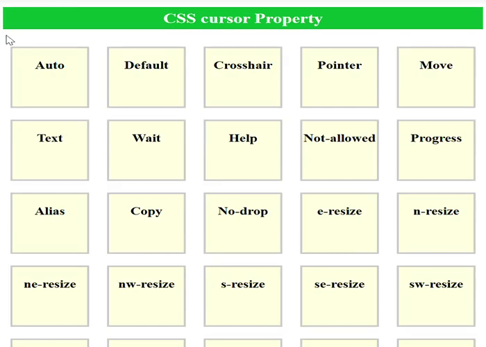
cursor
CSS cursor defines the shape of the cursor.
cursor: auto | default | pointer | text | wait | crosshair | move | not-allowed | grab;
Code Example:
<html>
<head>
    <title>CSS Cursor Property</title>
    <style>
        h2 {
            padding: 5px;
            background-color: #04af2f;
            color: white;
            text-align: center;
        }
        .demo-cursor {
            display: inline-block;
            background-color: LightYellow;
            width: 100px;
            height: 100px;
            margin: 10px;
            border: 3px solid #ccc;
            cursor: pointer;
        }
        h3 {
            text-align: center;
        }
        .default {
            cursor: default;
        }
        .auto {
            cursor: auto;
        }
        .crosshair {
            cursor: crosshair;
        }
        .pointer {
            cursor: pointer;
        }
        .move {
            cursor: move;
        }
        .text {
            cursor: text;
        }
        .wait {
            cursor: wait;
        }
        .help {
            cursor: help;
        }
        .not-allowed {
            cursor: not-allowed;
        }
        .progress {
            cursor: progress;
        }
        .alias {
            cursor: alias;
        }
        .copy {
            cursor: copy;
        }
        .no-drop {
            cursor: no-drop;
        }
        .e-resize {
            cursor: e-resize;
        }
        .n-resize {
            cursor: n-resize;
        }
        .ne-resize {
            cursor: ne-resize;
        }
        .nw-resize {
            cursor: nw-resize;
        }
        .s-resize {
            cursor: s-resize;
        }
        .se-resize {
            cursor: se-resize;
        }
        .sw-resize {
            cursor: sw-resize;
        }
        .w-resize {
            cursor: w-resize;
        }
        .ew-resize {
            cursor: ew-resize;
        }
        .ns-resize {
            cursor: ns-resize;
        }
        .nesw-resize {
            cursor: nesw-resize;
        }
        .nwse-resize {
            cursor: nwse-resize;
        }
        .col-resize {
            cursor: col-resize;
        }
        .row-resize {
            cursor: row-resize;
        }
        .zoom-in {
            cursor: zoom-in;
        }
        .zoom-out {
            cursor: zoom-out;
        }
        .grab {
            cursor: grab;
        }
        .grabbing {
            cursor: grabbing;
        }
    </style>
</head>
<body>
    <h2>CSS cursor Property</h2>
    <div class="demo-cursor auto">
        <h3>Auto</h3>
    </div>
    <div class="demo-cursor default">
        <h3>Default</h3>
    </div>
    <div class="demo-cursor crosshair">
        <h3>Crosshair</h3>
    </div>
    <div class="demo-cursor pointer">
        <h3>Pointer</h3>
    </div>
    <div class="demo-cursor move">
        <h3>Move</h3>
    </div>
    <div class="demo-cursor text">
        <h3>Text</h3>
    </div>
    <div class="demo-cursor wait">
        <h3>Wait</h3>
    </div>
    <div class="demo-cursor help">
        <h3>Help</h3>
    </div>
    <div class="demo-cursor not-allowed">
        <h3>Not-allowed</h3>
    </div>
    <div class="demo-cursor progress">
        <h3>Progress</h3>
    </div>
    <div class="demo-cursor alias">
        <h3>Alias</h3>
    </div>
    <div class="demo-cursor copy">
        <h3>Copy</h3>
    </div>
    <div class="demo-cursor no-drop">
        <h3>No-drop</h3>
    </div>
    <div class="demo-cursor e-resize">
        <h3>e-resize</h3>
    </div>
    <div class="demo-cursor n-resize">
        <h3>n-resize</h3>
    </div>
    <div class="demo-cursor ne-resize">
        <h3>ne-resize</h3>
    </div>
    <div class="demo-cursor nw-resize">
        <h3>nw-resize</h3>
    </div>
    <div class="demo-cursor s-resize">
        <h3>s-resize</h3>
    </div>
    <div class="demo-cursor se-resize">
        <h3>se-resize</h3>
    </div>
    <div class="demo-cursor sw-resize">
        <h3>sw-resize</h3>
    </div>
    <div class="demo-cursor w-resize">
        <h3>w-resize</h3>
    </div>
    <div class="demo-cursor ew-resize">
        <h3>ew-resize</h3>
    </div>
    <div class="demo-cursor ns-resize">
        <h3>ns-resize</h3>
    </div>
    <div class="demo-cursor nesw-resize">
        <h3>nesw-resize</h3>
    </div>
    <div class="demo-cursor nwse-resize">
        <h3>nwse-resize</h3>
    </div>
    <div class="demo-cursor col-resize">
        <h3>col-resize</h3>
    </div>
    <div class="demo-cursor row-resize">
        <h3>row-resize</h3>
    </div>
    <div class="demo-cursor zoom-in">
        <h3>Zoom-in</h3>
    </div>
    <div class="demo-cursor zoom-out">
        <h3>Zoom-out</h3>
    </div>
    <div class="demo-cursor grab">
        <h3>Grab</h3>
    </div>
    <div class="demo-cursor grabbing">
        <h3>Grabbing</h3>
    </div>
</body>
</html>
display
CSS display controls how an element is displayed.
display: none | block | inline | flex | grid | inline-block | inline-flex | inline-grid | table | inline-table | contents;
float
CSS float determines if an element floats to the left or right, allowing text to wrap around it or be displayed inline.
float: none | left | right | initial | inherit;
position
CSS position sets the positioning model for an element.
position: static | relative | absolute | fixed | sticky;
visibility
CSS visibility determines if an element is visible in the document.
visibility: visible | hidden | collapse | initial | inherit;
CSS Functions
CSS functions can be used to add style and formatting to your website or application and can greatly improve the user experience.
Follow the below list of functions types to know each one of them.
Transform Functions
CSS Transform Functions define how an element is visually transformed.
transform: <transform-function> <transform-function>*;
Common transform functions used in CSS are: rotate(), rotate3d(), scale(), scale3d(), skew(), translate(), and translate3d().
Math Functions
CSS Math Functions perform mathematical operations within CSS properties.
property: calc(expression);
Common transform functions used in CSS are: calc(), max(), min(), round() and trigonometric functions.
Filter Functions
CSS Filter Functions apply graphical effects like blur, brightness, and contrast.
filter: none | blur() | brightness() | contrast() | drop-shadow() | grayscale() | hue-rotate() | invert() | opacity() | saturate() | sepia() | url();
Color Functions
CSS Color Functions define colors in multiple formats.
color(colorspace c1 c2 c3[ / A])
Image Functions
CSS Image Functions generate images or gradients.
<image> = <url> | <image-list> | <element-reference> | <gradient></gradient>
Counter Functions
CSS Counter Functions work with the content property for automatic numbering.
content: counter(name, style);
Shape Functions
CSS Shape Functions define clipping and shape effects.
clip-path: circle(radius) | ellipse(rx ry) | polygon(x1 y1, x2 y2, ...);
Reference Functions
CSS Reference Functions allow referencing values defined elsewhere.
property: var(--custom-property, fallback-value);
Grid Functions
CSS Grid Functions define grid layouts.
grid-template-columns: none | auto | max-content | min-content | minmax() | length | percentage | fit-content() | repeat() | subgrid | initial | inherit;
Font Functions
CSS Font Functions control font rendering dynamically.
font-variant-alternates: normal | stylistic(<feature>) || historical-forms || styleset(<feature>) || character-variant(<feature>) || swash(<feature>) || ornaments(<feature>) || annotation(<feature>);
Easing Functions
CSS Easing Functions control animation timing.
transition-timing-function: ease | linear | ease-in | ease-out | ease-in-out | cubic-bezier(x1, y1, x2, y2);
Note: To know in details about each function please check the article CSS Functions.
Media Queries
Media Queries allow to apply CSS styles to a webpage based on the characteristics of the device or browser viewing the page. With media queries, we can create designs that adapt to different screen sizes, resolutions, and orientations.
- CSS Media Types
- CSS Media Features
CSS Media Types
all: Suitable for all devices.
print: Intended for paged, opaque material and for documents viewed on screen in print preview mode. Please consult the section on paged media.
@media print {
    selector {
        css-property: value;
    }
}
screen: Intended primarily for color computer screens.
@media screen {
    selector {
        css-property: value;
    }
}
CSS Media Features
orientation: To check whether the device's screen or page is in a portrait or landscape orientation.
@media (orientation: portrait) {
    div {
        background: lightgreen;
    }
}
aspect-ratio: To check the aspect ratio of the viewport or the rendering surface.
@media (max-aspect-ratio: 3/2) {
    div {
        background:violet;
    }
}
display-mode: To check the display mode of a web-application.
@media (display-mode: fullscreen) {
    body {
        background-color: violet;
        color: white;
    }
}
overflow-block: To determine how the user device handles content that goes beyond the initial container's boundaries in a vertical direction.
@media (overflow-block: paged) {
    p {
        color: green;
    }
}
overflow-inline: To determine how the user device handles content that goes beyond the initial container's boundaries in a horizontal direction.
@media (overflow-inline: scroll) {
    p {
        color: blue;
    }
}
height: To determine the height of the viewport.
@media (height: 150px) {
    div {
        background:violet;
    }
}
width: To determine the width of the viewport.
@media (width: 200px) {
    div {
        background: pink;
    }
}
Conclusion
Following this Cheat Sheet will keeps you revised on CSS, if your are new to CSS then we will recommend you to follow our free CSS Tutorial.
You can check our other Cheat Sheets