- CSS - Home
- CSS - Roadmap
- CSS - Introduction
- CSS - Syntax
- CSS - Inclusion
- CSS - Types
- CSS - Measurement Units
- CSS - Selectors
- CSS - Colors
- CSS - Backgrounds
- CSS - Fonts
- CSS - Text
- CSS - Images
- CSS - Links
- CSS - Tables
- CSS - Borders
- CSS - Border Block
- CSS - Border Inline
- CSS - Margins
- CSS - Lists
- CSS - Padding
- CSS - Cursor
- CSS - Outlines
- CSS - Dimension
- CSS - Scrollbars
- CSS - Inline Block
- CSS - Dropdowns
- CSS - Visibility
- CSS - Overflow
- CSS - Clearfix
- CSS - Float
- CSS - Arrows
- CSS - Resize
- CSS - Quotes
- CSS - Order
- CSS - Position
- CSS - Hyphens
- CSS - Hover
- CSS - Display
- CSS - Focus
- CSS - Zoom
- CSS - Translate
- CSS - Height
- CSS - Hyphenate Character
- CSS - Width
- CSS - Opacity
- CSS - Z-Index
- CSS - Bottom
- CSS - Navbar
- CSS - Overlay
- CSS - Forms
- CSS - Align
- CSS - Icons
- CSS - Image Gallery
- CSS - Comments
- CSS - Loaders
- CSS - Attr Selectors
- CSS - Combinators
- CSS - Root
- CSS - Box Model
- CSS - Counters
- CSS - Clip
- CSS - Writing Mode
- CSS - Unicode-bidi
- CSS - min-content
- CSS - All
- CSS - Inset
- CSS - Isolation
- CSS - Overscroll
- CSS - Justify Items
- CSS - Justify Self
- CSS - Tab Size
- CSS - Pointer Events
- CSS - Place Content
- CSS - Place Items
- CSS - Place Self
- CSS - Max Block Size
- CSS - Min Block Size
- CSS - Mix Blend Mode
- CSS - Max Inline Size
- CSS - Min Inline Size
- CSS - Offset
- CSS - Accent Color
- CSS - User Select
- CSS - Cascading
- CSS - Universal Selectors
- CSS - ID Selectors
- CSS - Group Selectors
- CSS - Class Selectors
- CSS - Child Selectors
- CSS - Element Selectors
- CSS - Descendant Selectors
- CSS - General Sibling Selectors
- CSS - Adjacent Sibling Selectors
- CSS Advanced
- CSS - Grid
- CSS - Grid Layout
- CSS - Flexbox
- CSS - Visibility
- CSS - Positioning
- CSS - Layers
- CSS - Pseudo Classes
- CSS - Pseudo Elements
- CSS - @ Rules
- CSS - Text Effects
- CSS - Paged Media
- CSS - Printing
- CSS - Layouts
- CSS - Validations
- CSS - Image Sprites
- CSS - Important
- CSS - Data Types
- CSS3 Advanced Features
- CSS - Rounded Corner
- CSS - Border Images
- CSS - Multi Background
- CSS - Color
- CSS - Gradients
- CSS - Box Shadow
- CSS - Box Decoration Break
- CSS - Caret Color
- CSS - Text Shadow
- CSS - Text
- CSS - 2d transform
- CSS - 3d transform
- CSS - Transition
- CSS - Animation
- CSS - Multi columns
- CSS - Box Sizing
- CSS - Tooltips
- CSS - Buttons
- CSS - Pagination
- CSS - Variables
- CSS - Media Queries
- CSS - Functions
- CSS - Math Functions
- CSS - Masking
- CSS - Shapes
- CSS - Style Images
- CSS - Specificity
- CSS - Custom Properties
- CSS Responsive
- CSS RWD - Introduction
- CSS RWD - Viewport
- CSS RWD - Grid View
- CSS RWD - Media Queries
- CSS RWD - Images
- CSS RWD - Videos
- CSS RWD - Frameworks
- CSS References
- CSS Interview Questions
- CSS Online Quiz
- CSS Online Test
- CSS Mock Test
- CSS - Quick Guide
- CSS - Cheatsheet
- CSS - Properties References
- CSS - Functions References
- CSS - Color References
- CSS - Web Browser References
- CSS - Web Safe Fonts
- CSS - Units
- CSS - Animation
- CSS Resources
- CSS - Useful Resources
- CSS - Discussion
CSS Interview Questions
CSS stands for Cascading Style Sheets and is used to define the visual appearance and layout of web pages. CSS was first introduced by Hkon Wium Lie in 1996 to separate content structure from presentation for making it easier to style web pages.
In this article, I present a list of commonly asked questions in CSS from the interview experience of multiple candidates. These questions are categorized into three parts: beginner level, intermediate level, and advanced level. In my experience, interviewers hardly plan to ask any particular question during your interview, questions usually start with basic concepts of the subject, and later they continue based on how you answer. If you answer well, they may ask more advanced questions to test the depth of your knowledge.
This article focuses only on interview-specific topics, so for a quick revision on all topics of CSS, check out the CSS quick guide and for a complete tutorial visit CSS tutorial.
List of CSS Interview Questions and Answers
- Basic CSS Questions And Answers For Beginners
- Intermediate CSS Questions and Answers
- Advanced CSS Interview Questions and Answers
Basic CSS Questions And Answers For Beginners
This section covers 20 basic CSS interview question along with their answers. Check out this section if you are absolute beginner to CSS.
1. What is CSS?
CSS stands for Cascading Style Sheets, is a language used to style and format the layout of web pages written in HTML. With CSS we can style webpage by changing color of the text, the style of fonts, the spacing between paragraphs, how columns are sized and laid out, what background images or colors are used.
2. What are advantages of using CSS?
Following are the advantages of using CSS.
- Pages load faster: If you are using CSS, you do not need to write HTML tag attributes every time. Just write one CSS rule of a tag and apply it to all the occurrences of that tag. Since number of lines of code are reduced, our webpage will load faster.
- Easy maintenance: To make a global change, simply change the root style, and all elements in all the web pages will be updated automatically.
- Superior styles to HTML: CSS has a much wider array of attributes than HTML, so you can get a far better look to your HTML page.
- Multiple Device Compatibility: For the same HTML document, different versions of a website can be presented for different screen widths
- Global web standards: Now most of the HTML attributes are being deprecated and it is being recommended to use CSS.
3. What are the drawbacks of CSS?
Following are the drawbacks of using CSS.
- Browser Compatibility: There are different levels of CSS i.e. CSS, CSS 2, CSS 3 which are often quite confusing. And these versions works differently on different browsers. Not all browsers support every CSS property in the same way.
- Complexity with Large Projects: For large projects, managing CSS can become difficult. It may lead to redundant or conflicting styles if not organized well.
- No Built-in Security: CSS does not offer security features. Hackers may view your CSS code and exploit vulnerabilities if they exist.
- Global Scope: CSS rules apply globally by default, which can lead to unintended styling effects. We need to organize code well to avoid this.
4. What is difference between CSS and CSS3?
CSS3 is latest version of CSS. CSS3 have advanced features and functionalities. Following are the differences between features of CSS and CSS3.
| Features | CSS | CSS3 |
|---|---|---|
| Selectors | CSS only has basic selectors, such as element, class, and ID selectors. | CSS3 introduces advanced selectors like nth-child and attribute selectors for more precise targeting. |
| Media Queries | Media queries are not supported in CSS. | CSS3 supports media queries for responsive design based on device properties like width and orientation. |
| Animation | CSS doesnt have direct animation properties (JavaScript needed to apply animation) | CSS3 includes properties like transition and animation to create animations without JavaScript. |
| Gradients | Gradients are not directly supported in CSS. | CSS3 supports gradients with the `linear-gradient` and `radial-gradient` properties. |
5. What is syntax for CSS Style?
The syntax of CSS consist of selectors and declaration used to apply styles to HTML elements.
selector {
    property: value;
}
- The selector targets the HTML element/elements that you want to style.
- The declaration block contains one or more declarations enclosed in curly braces {}.
- Each declaration consists of a property and a value separated by a colon :. Declarations are separated by semicolons ;.
There are several types of selectors available in CSS, commonly used selectors are classes, IDs and tags. To know complete list of selectors visit our tutorial on CSS Selectors.
6. How to add CSS to HTML page?
There are three ways to add CSS styles to HTML webpage,
- Internal CSS: In this case CSS codes are placed inside HTML files itself.
- External CSS: A separate file is made for CSS and imported to HTML file.
- Inline CSS: Styles for each tag can be exclusively provided using "style" attribute.
To see example for each method, check out article CSS - How to add.
7. Which type of CSS has the highest priority?
In CSS, specificity determines the priority of styles. Inline CSS has the highest priority, followed by internal CSS, and then external CSS. To learn more, refer to CSS Specificity.
8. What are selectors in CSS?
CSS Selectors are used to select the HTML elements we want to style on a web page. They can target specific elements or groups of elements to apply styles like colors, fonts, margins, and more. Following are types of selectors in CSS.
9. What is universal selector?
Universal selector, denoted by an asterisk mark (*), is a special selector that matches all elements in an HTML document. These are generally used to add a same length margin and padding to all the elements in document.
* {
   color: #000000;
}
This rule sets color of every texts in webpage to black.
10. What is class selector?
A class selector targets an element with a specific value for its class attribute to style it. A class in CSS is denoted by "." (period) symbol.
.black {
   color: #000000;
}
This rule sets color of text inside all the elements having class as ".black" in the webpage to black color.
11. What is an ID selector?
An ID selector targets a specific element with a unique id attribute to style it individually. In CSS, an ID is represented by the "#" (hash) symbol.
#main-heading {
   color: #333333;
}
This rule sets the text color of the element with the id "main-heading" to dark gray.
12. What is an element selector?
An element selector applies styles to all instances of a specific HTML element across the webpage. It uses the tag name directly without any symbols.
p {
   font-size: 16px;
}
This rule sets the font size of all `<p>` (paragraph) elements to 16px.
13. What is an Attribute Selector?
An attribute selector in CSS targets elements based on the presence or value of a specific attribute. It is represented by square brackets around the attribute name.
a[target="_blank"] {
   color: blue;
   text-decoration: underline;
}
This rule applies a blue color and underline style to all `<a>` elements with the attribute `target="_blank"`, indicating links that open in a new tab.
14. How to add comments in CSS?
In CSS, comments can be added using `/* */`. Anything between `/*` and `*/` is treated as a comment and will not be rendered by the browser. Following is syntax to add comments in CSS.
/* This is a comment */
p {
    color: red; /* Set text color to red */
}
CSS comments are intended for the benefit of developers and are ignored by the browser when rendering a web page. They are useful in documentation, debugging, etc.
15. How to set color in CSS?
In CSS, the `color` property is used to set the text color for an element. You can specify colors in multiple formats, such as name, HEX, RGB, RGBA, HSL, and HSLA values.
/* Examples of setting color */
p {
    color: blue;           /* Named color */
    color: #ff0000;        /* HEX color */
    color: rgb(255, 0, 0); /* RGB color */
    color: rgba(255, 0, 0, 0.5); /* RGBA color with 50% opacity */
    color: hsl(0, 100%, 50%);    /* HSL color */
    color: hsla(0, 100%, 50%, 0.5); /* HSLA color with 50% opacity */
}
- Named Colors: Set color using standard color names like `red`, `blue`, etc.
- HEX Colors: Set color using a HEX code, e.g., `#ff0000`.
- RGB Colors: Set color using RGB values, e.g., `rgb(255, 0, 0)`.
- RGBA Colors: Similar to RGB, but includes an alpha parameter for opacity, e.g., `rgba(255, 0, 0, 0.5)`.
- HSL Colors: Set color using HSL (Hue, Saturation, Lightness), e.g., `hsl(0, 100%, 50%)`.
- HSLA Colors: Similar to HSL, but with an alpha parameter, e.g., `hsla(0, 100%, 50%, 0.5)`.
15. What are CSS background properties?
Background properties in CSS are used to control background graphics of HTML elements. We can set plain color, image, gradient for all the element HTML structure.
- background-color: Used to define a solid background color for an element.
- background-image: Used to set an image or a gradient as the background.
- background-position: Used to specify the starting position of the background image .
- background-size: Used to adjust the size of the background image.
16. What are different CSS Border Properties?
Border properties in CSS are used to control the appearance of borders around HTML elements. With these properties, we can set the color of border, style, width, and even apply rounded corners.
- border-width: Specifies the width of the border, which can be in units like pixels, ems, or keywords such as `thin`, `medium`, or `thick`.
- border-style: Defines the style of the border, such as `solid`, `dashed`, `dotted`, or `none`.
- border-color: Sets the color of the border. It can be specified using color names, HEX codes, RGB, or HSL values.
- border-radius: Specify roundness of corner of border.
/* Example of border properties */
.box {
    border-width: 2px;
    border-style: solid;
    border-color: #3498db;
    border-radius: 10px;
}
17. What is transition in CSS?
CSS Transitions are used to smoothly change CSS properties over a specified time duration. Look at the example below.
Following code stimulate smooth transition of background color of button from lightblue to deepskyblue when user is hovered over the button.
.button {
    background-color: lightblue;
    transition: background-color 0.3s ease; /* Smooth color change on hover */
}

.button:hover {
    background-color: deepskyblue;
}
18. How to hide an element in CSS
We can hide an element in CSS by setting the `display` or `visibility` properties.
- Using display: When you set an element's display property to `none`, it is removed from the document flow, and the space it occupied is also removed.
- Using visibility: Setting the visibility property to `hidden` makes the element invisible, but it still occupies space in the layout.
/* The element will not be visible and won't take up space */
.hidden {
    display: none;
}

/* The element will not be visible but will still take up space */
.invisible {
    visibility: hidden;
}
19. Explain the difference between margin and padding
Both margin and padding are used to create space around elements, but have different purposes. Margin is the space outside an element, creating distance between it and other elements, while padding is the space inside an element, ie the space between content and border of element. The following image shows padding and margin of an element in box model structure.

Learn more with examples, CSS Margins and CSS Padding.
20. Explain CSS box model
CSS box model, as shown in image above is a layout concept that describes how elements are displayed on a webpage. This model treats each element as a rectangular box consisting of content, padding, border, and margin areas. we have two types of box model.
- Standard box model: In this model content area of element is defined only from height and width of element. Padding, borders, and margins are added outside the content area. Following is code for standard box model.
.box {
    width: 300px;
    height: 100px;
    padding: 20px;
    box-sizing: content-box; /* This is the default value */
}
.box{
    width: 300px;
    height: 150px;
    padding: 20px;
    box-sizing: border-box; /* Margin & padding included in content area */
}
Intermediate CSS Questions and Answers
This section will cover 15 intermediate questions in CSS, which will cover key topics like advanced selectors, layout systems, animation, calc() function, media-queries, display inline block, specificity and responsive units.
21. What are pseudo-class and pseudo-element selectors?
Pseudo-classes in CSS are used to select and style elements based on their state or position within the document tree, without the need for adding extra classes or JavaScript. For example styling a button when mouse moves over or clicked on it.
/* Example of Pseudo-class, Styling a link when mouse hovered*/
a:hover {
    color: red;
}
A pseudo-element in CSS, is used to style a specific part of an element that are not the part of the DOM (Document Object Model) and do not exist in the HTML markup. For Example first letter of a paragraph, placeholder text inside input element or selected part in a document.
/* Example of pseudo-element, Styling first letter of a paragraph */
p::first-letter {
    text-transform: uppercase;
    font-size: 2em;
    color: darkred;
    font-style: italic;
}
22. What are descendant and child selectors?
Descendant Selectors in CSS are used to select elements that are nested within another element, no matter how deep the nesting is. They are represented by a space between the parent and child selectors. For example, if you want to style all paragraphs that are inside a div, you would write:
/* Example of Descendant Selector */
div p {
    color: blue; /* Affects all paragraphs inside any div */
}
Child Selectors only select elements that are directly nested within a parent element, and not consider deeper levels of nesting. This is represented by the > symbol. For instance, to style only the paragraphs that are directly inside a specific div, you would write:
/* Example of Child Selector */
div > p {
    color: green; /* Affects only the direct child paragraphs of a div */
}
23. What are adjacent sibling and general sibling selectors?
Adjacent Sibling Selectors in CSS are used to select an element that is immediately next to a specific element, sharing the same parent. The adjacent sibling selector is represented by a plus sign (`+`). For example, if you want to select the first `p` element that immediately follows an `h2` element, you would write:
/* Example of Adjacent Sibling Selector */
h2 + p {
    color: red; /* Affects only the first paragraph immediately after an h2 */
}
General Sibling Selectors select all elements that share the same parent, and come after a specific element, not necessarily immediately next to it. The general sibling selector is represented by a tilde (~). For instance, if you want to style all `p` elements that are siblings of an `h2` element, you would write:
/* Example of General Sibling Selector */
h2 ~ p {
    color: purple; /* Affects all paragraphs that are siblings of h2 */
}
24. What is flexbox layout system? How to setup flex layout?
Flexbox is a one-dimensional layout system in CSS that is used to arrange items inside container either horizontally or vertically. This system ensure responsive design using several properties for item sizing and alignment. The diagram shows flexbox layout in a container.
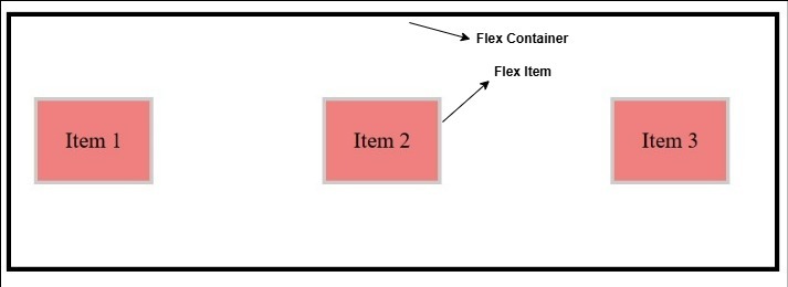
Designing flexbox systems is very simple. We just need to set display property of container as flex. Then we can use flex related properties to control alignment of items inside container. Following code shows an example of flex layout system.
.container {
    display: flex;
    justify-content: space-between; /* Ensures Evenly spaced items */
    align-items: center; /* Centering items Vertically */
}
.item {
    background-color: lightcoral;
    padding: 20px;
    border: 3px solid #ccc;
}
25. Explain CSS grid layout and how to set it up?
CSS Grid Layout is a two-dimensional layout system for developing responsive webpages. Grid Layout is ideal for creating overall structure of a webpage, while flexbox is mostly used to align items inside a container. Following image shows how a grid layout look like with 12 column structure.
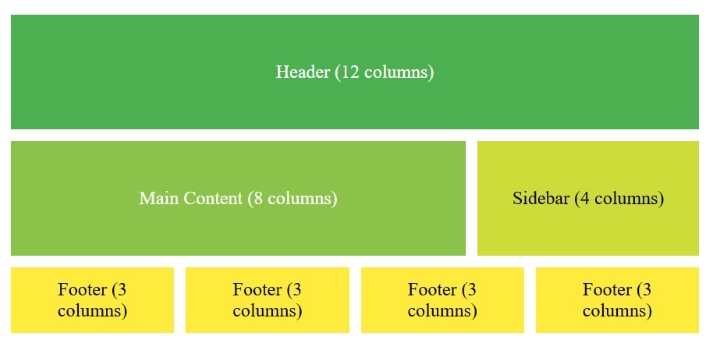
To use the grid layout, set the container's display property to `grid`. Then, we can define the number and size of rows and columns using properties like grid-template-rows and grid-template-columns. The following example code shows a basic grid layout.
.container {
    display: grid;
    grid-template-columns: repeat(3, 1fr); /* Creates 3 columns */
    grid-template-rows: auto; /* Rows adjust based on content height */
    gap: 10px; /* Space between grid items */
}
.item {
    background-color: lightblue;
    padding: 20px;
    border: 2px solid #ddd;
}
26. How do you create an animation in CSS?
We can setup animation in CSS using the @keyframes rules. The `@keyframes` rule define an animation by specifying how the animated element look at various stage of animation. Consider the following code that defines a keyframe rule.
@keyframes colorChange {
    0% {
        background-color: red;
    }
    50% {
        background-color: green;
    }
    100% {
        background-color: blue;
    }
}
This keyframe rule is defined for an animation named colorChange.
- At 0% of total duration of animation( ie, 0 seconds) the background color will be red.
- At 50% of total time( ie, 2.5 seconds) the background color changes to green
- At 100% of total duration( ie, 5 seconds) color changes to blue.
Now, keyframes rules is defined. we can apply this to any element in webpage. Following code applies the animation to class '.box'.
.box{
    animation: colorChange 5s infinite;
}
This code will define animation for element with class `.box`, the name of animation is `colorChange`, run for 5 seconds and it repeats infinite number of times.
27. How do you use the calc() function in CSS?
The `calc()` function in CSS is used to perform calculations directly within CSS properties. This function can add, subtract, multiply, or divide values, making it especially helpful for responsive designs where elements need flexible dimensions.
/* Example using calc() to set width */
div {
   width: calc(100% - 20px); /*Sets width as total width minus 20px*/
}
With `calc()`, you can mix different units (like `px`, `%`, and `em`) in a single calculation, which can be useful for layouts that need to adapt to various screen sizes.
28. Explain how to use nth-child() selector in CSS
The :nth-child(n) is a pseudo-class that will apply style to any specified direct child of an element.
/* Syntax */
tag:nth-child(number / expression / odd / even) {
    property: value;
}
The pseudo-class nth-child can take number, mathematical expression or values like odd, even as parameter.
- number: We can specify any number to this function, which represent chronological order of child elements, For example nth-child(4) will select 4th child of parent element.
- odd/even: We can also use this function to select all odd/even occurrences of child element.
- expression: We can provide any meaningful mathematical expression in terms of variable 'n' to this function. For example, nth-child(3n) will selects all the child occurring at multiple of 3.
/* Examples */
/* Apply Style to 2nd child of div */
div:nth-child(2){
   background-color:red;
}

/* Apply Style to all odd children of li */
li:nth-child(odd) {
   background-color: lightgray;
}

/* Apply Style to 2n+1 th children, where n is 1, 2 ,3..., */
li:nth-child(2n+1) {
   background-color: lightblue;
}
29. How to center an element inside a container?
Centering an element within a container can be done in several ways, depending on the layout and the type of centering needed. Here are some common methods:
- Using Flexbox: Apply `display: flex;` and `justify-content: center;` and `align-items: center;` on the container to center the element both horizontally and vertically.
.container {
    display: flex;
    justify-content: center; /* Horizontal Centering */
    align-items: center; /* Vertical Centering */
    height: 200px;
}
By setting above code for a container, the element inside the container will be centered. However, if you have multiple elements in the container, then you can use `justify-content: space-around` to provide even space around all element.
- Using Margin Auto (Horizontal Centering): For block elements, you can use `margin: auto;` to center the element horizontally.
/* Horizontal centering with margin auto */
.element {
    width: 100px;
    height: 50px;
    background-color: lightgreen;
    margin: auto;
}
30. What is CSS media query? How is it working?
Media queries in CSS are used to apply different CSS styles based on the screen size, resolution, and other characteristics of the user device. Media queries uses @media rule to include a extra block of CSS properties when a certain conditions are met. Media queries can also be used to style printable version of page separately.
@media not|only mediatype and (media feature) and (media feature) {
    CSS-Code;
}
Here, media-type can be things like screen, print, speech, etc., and media-feature can be characteristics such as width, height, aspect ratio, orientation, and more.
/* Example */

/* Style for screen size less than 500px */
@media screen and (max-width: 500px) {
    .container {
        flex-direction: column; /* Column layout on small screen */
    }
}

/* Styles for landscape orientation screen */
@media (orientation: landscape) {
    body {
        color: blue;
    }
}
31. How to style a webpage for printing?
To style a page explicitly for printing, we have two methods:
- Using External Stylesheet: We can have a external stylesheet explicitly for printing needs. For that we need to set the value for media attribute as "print" for link tag. Add the following tag to head section of your HTML document.
<link href="/path/to/print.css" media="print" rel="stylesheet" />
The print.css will look like this:
body{
    background-color: white;
    color: black;
}
.navbar{
    display: none;
}
- Using Media Queries and @page: CSS media queries can be used to style printable versions in internal stylesheet itself. The @page rule is used to control aspects like the size, orientation, and margins of the printed content.
@media print {
    body{
        background-color: white;
        color: black;
    }
    .navbar{
        display: none;
    }
}
@page {
    size: A4 portrait; /* A4 size, portrait orientation */
    margin: 2cm; /* 2cm margins on all sides */
}
32. What is CSS specificity? How to override specificity?
The specificity order for selectors in CSS is a criteria to determine which selector have highest preference to be used for an element, when multiple selectors are specifying same property.
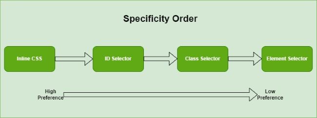
For instance, if a CSS property specified on an HTML element using both class selector and ID selector, the property declared in the selector with highest specificity value(in this case Id selector) will be applied on that element. Following are some rules for specificity in CSS.
- The selector with highest specificity value will take effect.
- For equal specificity value, latest rule wins.
- Internal CSS style is always preferred over external stylesheet
However, the order of specificity become irrelevant if any property is marked as !important. Which means, if any property in any selector is marked as important, then the property has highest preference regardless of selector used. Following code shows how to override specificity.
#unique {
    color: darkgreen; /* This is ignored */
}

.special {
    color: blue !important; /* This will take effect */
}

<p id="unique" class="special"> This is paragraph </p>
Check out chapter on !important rule to learn more.
33. Explain the difference between inline, block, and inline-block elements.
Inline, block and inline-block are values of CSS display property. Following table shows the difference between 'display: inline', 'display: block' and 'display: inline-block' properties.
| inline | block | inline-block |
|---|---|---|
| The element is displayed on the same line. | The element is displayed on a new line. | The element is displayed on the same line . |
| It does not take up the full width of the container. | It takes up the full width of the container. | It does not take up the full width of the container. |
| It does not have a margin or padding by default. | It has a margin and padding by default. | It has a margin and padding by default. |
The below interactive section shows visual difference between this values.
34. What is difference between border and outline in CSS?
In CSS, outlines are used to create line around the outside of an element's border, without impacting its size or layout. However, borders are used to create a visible separation between elements. Which means a border will takes up spaces in layout, but outlines won't take space in layout. Following image shows outline and border of an element.
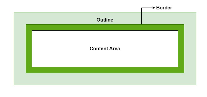
- An outline does not take up space, which means an outline can overlap with adjacent elements if there is no enough margin. On the other hand, the border will never overlap with adjacent element.
- Outline is always the same on all sides. But border can be varied on each side.
- Outlines do not have to be rectangular because they follow the shape of the element to which they are applied.
- Outlines are often used to highlight elements when they receive focus (by pressing tab or clicking). While borders are used to make visual separation between elements.
Visit CSS outlines and CSS borders, to see examples and learn more.
35. How do you style a visited link in CSS?
To style a visited link in CSS, we can use the :visited pseudo-class, which targets links that the user has already clicked on. Heres an example.
a:visited {
  color: purple;     /* Change the text color */
  font-weight: bold; /* Make the link bold */
}
- For security reasons, visited link have limited styling options. Which means we cannot apply properties that reveal layout changes such as display, position to visited links.
- Commonly allowed properties include color, background-color, text-decoration, and outline.
36. What are responsive units? Why they are used?
Responsive units are a set of special units used in CSS to describe measurements that can be scaled by the browser based on the viewport width or height. The most common responsive units are:
- vw (viewport width): This unit is based on 1% of the viewport's width. For example, 10vw would equal 10% of the viewport's total width.
- vh (viewport height): This unit is based on 1% of the viewport's height. For example, 50vh would be half the viewport's height.
- vmin: This unit takes the smaller value between the viewport's width and height. Its helpful when you want the size to adapt to both portrait and landscape orientations.
- vmax: This unit takes the larger value between the viewport's width and height, useful for designs that need to maximize space in larger viewports.
Advanced CSS Interview Questions and Answers
This section will cover 10 advanced questions in CSS, which include topics like clip path, import rule, custom properties, CSS cascade rule, counters, Houdini APIs, container queries, and critical CSS.
37. Explain the clip-path property and its use cases
The clip-path property in CSS is used to define a visible region of an element. This can be used to mask a certain portions of elements shape for creating visual effects. Following is syntax for clip-path property.
clip-path: shape-function | URL | none;
- shape-function: Defines a basic shape like a circle(), ellipse(), polygon(), or inset()
- URL: Links to an SVG <clipPath> element for more complex clipping.
- none: Remove all clippings, and make element completely visible.
We can apply clip-path to images to give them custom shapes, such as circles, triangles, or polygons. This way we can display profile pictures as circles without using an actual circular image.
/* Clips an element to circular path */
clip-path: circle(50%);

/*  Clips the element into an elliptical shape */
clip-path: ellipse(50% 40%);

/* Clips the element into a custom polygonal shape */
clip-path: polygon(50% 0%, 100% 100%, 0% 100%);

/* Clips the element by an inset rectangle */
clip-path: inset(10% 20%);
38. What is the @import rule in CSS, and how is it used?
The @import rule in CSS is used to import external CSS files to stylesheets. This help us to separate CSS code across multiple files and then bring them together into a single stylesheet. Following is syntax of @import rule.
/* Syntax */
@import url("styles.css");
- To avoid potential rendering issues, use @import at the beginning of stylesheet.
- Each @import rule creates an additional HTTP request, which can slow down page load times. So, Inline <link> elements in HTML are usually preferred for better performance.
- Performance issue doesnt occur in preprocessors like SASS, because files are combined into one before delivery.
Suppose you have a main stylesheet, main.css, and want to import a reset file and a theme file. You could organize it like this:
@import url("reset.css");
@import url("theme.css");

/* Additional styles */
body {
    font-family: Arial, sans-serif;
}
39. What are custom properties in CSS? What is :root?
Custom Properties are variables in CSS that are used to store and reuse values in stylesheet. These are same as variables in other programming languages. The :root pseudo-class is used to declare custom properties in CSS. We can also use any other selector to declare variables, but declaring in root: selector will give global access to the variable. The following code show how to declare and use custom properties in CSS.
/* Declare custom properties */
:root {
    --primary-color: #3498db;
    --font-size-large: 1.5rem;
}

/* Use custom properties */
body{
    background-color: var(--primary-color);
    font-size: var(--font-size-large)
}
40. Explain the CSS cascade and how styles are applied.
The CSS cascade is the process by which the browser determines which styles to apply when multiple rules could apply to the same element. CSS follows a specific order to resolve conflicts and decide which style to apply. This order includes:
- !important tag: The styles, marked with `!important`, have the highest priority and override other styles.
- Specificity: The browser checks how specific each selector is. ID selectors (`#id`) are more specific than class selectors (`.class`), which in turn are more specific than tag selectors (`p`, `div`).
- Source Order: If two rules have the same importance and specificity, the rule defined last in the CSS will be applied.
Every selectors in CSS have a specificity level, the cascading order is determined from this specificity order. Following are specificity order of CSS selectors.
- Inline Styles: The styles defined for an element using style attribute have highest priority.
- Id Selectors: In Selectors, id selector have highest priority.
- Classes, Attributes and Pseudo-classes: These are the next in line. Class selectors are prefixed with a ., attribute selectors use square brackets [], and pseudo-classes are prefixed with :
- Elements and Pseudo-elements: These have the lowest specificity. Element selectors use the element name directly, and pseudo-elements are prefixed with ::.
Using the CSS cascade, styles are applied based on the combination of importance, specificity, and source order, allowing developers to control how elements are styled under various conditions.
41. What are CSS counters, and how do you implement them?
CSS counters are a kind of variables maintained by CSS, which can be incremented, decremented, or reset at different points in your document. For instance, we can use counters to automatically assign numbers to paragraphs, headings, and lists. Follow these steps to implement automatic counter for list items in a webpage
- Initialize the Counter: To start using a counter, you first need to initialize it using the counter-reset property.
body {
    counter-reset: section;
}
This code initializes a counter named section with an initial value of 0. The counter is reset to 0 every time the body element appears.
- Increment the Counter: To increment the counter, use the counter-increment property.
li::before {
    counter-increment: section;
}
This code increments the section counter every time an <li> element appears and displays the count before text.
- Display the Counter: To display the value of the counter, use the counters() function.
li::before {
    content: counters(section, ".") " ";
}
This code displays the value of the section counter followed by a period and a space before the content of the li element.
42. What are CSS Houdini and its APIs?
CSS Houdini is a collection of low-level APIs that are used for creating custom styling, layout, and animation effects. With Houdini, developers can access the browser's CSS engine to define new properties and implement custom paint functions. Following are APIs in CSS Houdini.
- CSS Properties and Values API: These APIs are used to define custom properties with specific types and default values. Also, these can be useful for creating custom styles that can respond to variable changes across your application.
- Paint API (Paint Worklet): Used to create custom paint functions that can be used as background images or borders. It can generate complex patterns, gradients, or shapes directly in CSS without needing external images.
- Animation Worklet: Used to create custom animations that respond to scrolling, user interaction, or time-based events. With this we can create complex animations.
- Layout API: Used to create custom layout algorithms like masonry or grid layouts.
- Typed OM: It provides a way to work with CSS values as structured data instead of plain strings.
43. Explain `CSS Paint API` and `CSS Animation API`.
The CSS Paint API and CSS Animation API are two of the key components of the CSS Houdini suite. They provide developers low-level access to extend and customize how CSS paints and animates elements.
CSS Paint API (also known as the Paint Worklet) are used by developers to create custom graphics, patterns, and images programmatically with JavaScript, which can then be used as CSS backgrounds, borders, or other visual effects. The paint API uses a special JavaScript file that defines how to paint custom graphics. The worklet registers a paint function that the browser calls when it needs to render the graphic. Following code defines paint API using CSS and JavaScript.
<!--Example: Creating a Striped Background with the Paint API-->

<!--JavaScript Code-->
<script>
    // Register a new paint worklet
    registerPaint('stripes', class {
    paint(ctx, size) {
        // Draw stripes pattern
        ctx.fillStyle = '#f06';
        for (let i = 0; i < size.width; i += 20) {
        ctx.fillRect(i, 0, 10, size.height);
        }
    }
    });
</script>

<!--CSS Implementation-->
<style>
    .element {
        background-image: paint(stripes);
    }
</style>
CSS Animation API are used by developers to create complex and highly customizable animations that can react to user interactions, scroll events, or any other dynamic conditions. This method allows precise control over animations at runtime, making it possible to create animations that respond to input in real-time. The Animation API uses an Animation Worklet where developers define animation logic.
<!--Example: Creating a Scroll-Based Animation -->

<!--JavaScript Code-->
<script>
// Register a new animator
registerAnimator('scrollAnimator', class {
  animate(currentTime, effect) {
    effect.localTime = currentTime * 100; // Speed up the animation
  }
});
</script>


<!--CSS Implementation-->
<style>
    .element {
        animation-timeline: paint(scrollAnimator);
        animation-name: scrollAnimation;
    }

    @keyframes scrollAnimation {
        from { transform: translateY(0); }
        to { transform: translateY(100px); }
    }
</style>
44. Explain container queries and how they differ from media queries.
Container Queries and Media Queries are two techniques used in CSS to apply styles based on certain conditions. Container queries in CSS is used to apply styles based on the size of a containing element. While Media queries are used to apply style based on size of viewport.
- A container query can be defined using @container rule.
- We need to set the property `container-type: inline-size;` to make an element container for triggering container queries.
- Just like media queries, container queries listen to changes in the container's width, height, or other characteristics.
Following is CSS code for container queries.
/* Make a container */
.container {
  container-type: inline-size; /* Defines the container */
  width: 100%;
}

/* Apply styles based on container size */
@container (min-width: 500px) {
  .box {
    background-color: lightblue;
  }
}

@container (min-width: 800px) {
  .box {
    background-color: lightgreen;
  }
}
45. What is critical CSS and its importance.
Critical CSS is a technique used to optimize website loading performance by separating and prioritizing the CSS needed to render above-the-fold content (the part of the page visible without scrolling) from the rest of the CSS.
Here is how critical css works.
- Identify Critical CSS: Determine which CSS rules are necessary to style the above-the-fold content.
- Inline Critical CSS: Insert the critical CSS directly in the <head> section of the HTML document, so it loads immediately with the page.
- Defer Non-Critical CSS: Load the remaining CSS (non-critical CSS) after the main content has been displayed, by linking to an external CSS file that loads asynchronously.
Here is an example of using critical CSS in HTML document.
<!DOCTYPE html>
<html lang="en">
<head>
    <title>My Website</title>
    <style>
        /* Critical CSS inlined directly for faster rendering */
        body {
            font-family: Arial, sans-serif;
        }
        .header {
            background-color: #333;
            color: #fff;
            padding: 10px; }
    </style>
    <link rel="stylesheet" href="styles.css" media="print" onload="this.media='all'">
    <noscript><link rel="stylesheet" href="styles.css"></noscript>
</head>
<body>
  <div class="header">Welcome to My Website</div>
  <div class="main-content">This is the main content area.</div>
</body>
</html>