- CSS - Home
- CSS - Roadmap
- CSS - Introduction
- CSS - Syntax
- CSS - Inclusion
- CSS - Types
- CSS - Measurement Units
- CSS - Selectors
- CSS - Colors
- CSS - Backgrounds
- CSS - Fonts
- CSS - Text
- CSS - Images
- CSS - Links
- CSS - Tables
- CSS - Borders
- CSS - Border Block
- CSS - Border Inline
- CSS - Margins
- CSS - Lists
- CSS - Padding
- CSS - Cursor
- CSS - Outlines
- CSS - Dimension
- CSS - Scrollbars
- CSS - Inline Block
- CSS - Dropdowns
- CSS - Visibility
- CSS - Overflow
- CSS - Clearfix
- CSS - Float
- CSS - Arrows
- CSS - Resize
- CSS - Quotes
- CSS - Order
- CSS - Position
- CSS - Hyphens
- CSS - Hover
- CSS - Display
- CSS - Focus
- CSS - Zoom
- CSS - Translate
- CSS - Height
- CSS - Hyphenate Character
- CSS - Width
- CSS - Opacity
- CSS - Z-Index
- CSS - Bottom
- CSS - Navbar
- CSS - Overlay
- CSS - Forms
- CSS - Align
- CSS - Icons
- CSS - Image Gallery
- CSS - Comments
- CSS - Loaders
- CSS - Attr Selectors
- CSS - Combinators
- CSS - Root
- CSS - Box Model
- CSS - Counters
- CSS - Clip
- CSS - Writing Mode
- CSS - Unicode-bidi
- CSS - min-content
- CSS - All
- CSS - Inset
- CSS - Isolation
- CSS - Overscroll
- CSS - Justify Items
- CSS - Justify Self
- CSS - Tab Size
- CSS - Pointer Events
- CSS - Place Content
- CSS - Place Items
- CSS - Place Self
- CSS - Max Block Size
- CSS - Min Block Size
- CSS - Mix Blend Mode
- CSS - Max Inline Size
- CSS - Min Inline Size
- CSS - Offset
- CSS - Accent Color
- CSS - User Select
- CSS - Cascading
- CSS - Universal Selectors
- CSS - ID Selectors
- CSS - Group Selectors
- CSS - Class Selectors
- CSS - Child Selectors
- CSS - Element Selectors
- CSS - Descendant Selectors
- CSS - General Sibling Selectors
- CSS - Adjacent Sibling Selectors
- CSS Advanced
- CSS - Grid
- CSS - Grid Layout
- CSS - Flexbox
- CSS - Visibility
- CSS - Positioning
- CSS - Layers
- CSS - Pseudo Classes
- CSS - Pseudo Elements
- CSS - @ Rules
- CSS - Text Effects
- CSS - Paged Media
- CSS - Printing
- CSS - Layouts
- CSS - Validations
- CSS - Image Sprites
- CSS - Important
- CSS - Data Types
- CSS3 Advanced Features
- CSS - Rounded Corner
- CSS - Border Images
- CSS - Multi Background
- CSS - Color
- CSS - Gradients
- CSS - Box Shadow
- CSS - Box Decoration Break
- CSS - Caret Color
- CSS - Text Shadow
- CSS - Text
- CSS - 2d transform
- CSS - 3d transform
- CSS - Transition
- CSS - Animation
- CSS - Multi columns
- CSS - Box Sizing
- CSS - Tooltips
- CSS - Buttons
- CSS - Pagination
- CSS - Variables
- CSS - Media Queries
- CSS - Functions
- CSS - Math Functions
- CSS - Masking
- CSS - Shapes
- CSS - Style Images
- CSS - Specificity
- CSS - Custom Properties
- CSS Responsive
- CSS RWD - Introduction
- CSS RWD - Viewport
- CSS RWD - Grid View
- CSS RWD - Media Queries
- CSS RWD - Images
- CSS RWD - Videos
- CSS RWD - Frameworks
- CSS References
- CSS Interview Questions
- CSS Online Quiz
- CSS Online Test
- CSS Mock Test
- CSS - Quick Guide
- CSS - Cheatsheet
- CSS - Properties References
- CSS - Functions References
- CSS - Color References
- CSS - Web Browser References
- CSS - Web Safe Fonts
- CSS - Units
- CSS - Animation
- CSS Resources
- CSS - Useful Resources
- CSS - Discussion
CSS - Layouts
CSS Layout is essential for defining the visual structure, organization, and responsiveness of a website. In this tutorial, we will explore various CSS techniques to create effective website layouts.
Structure of Webpage Layout
A webpage is made up of various sections like header, menus, content, and footer based on which there are many different layout designs available for developers.
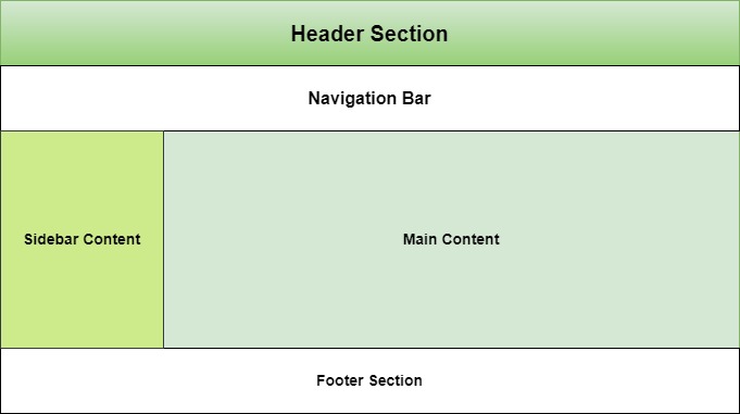
To know how to define a webpage structure, checkout our tutorial on HTML Layout. Here we explained each and every elements of a webpage layout. In this tutorial we will see how to style a webpage layout using CSS.
Table of Contents
CSS Normal Layout Flow
Normal flow is the default layout mode where elements are positioned in the order they appear in the HTML document.
- Block level elements like <div>, <p>, headings will stack vertically and takes up full width if not specified.
- Inline elements like <span>, <strong> stack horizontally. You cannot alter height and width of these elements.
- Inline block elements will behave like both inline and block. They will start from current line but you can alter it's size.
Let's see an example for CSS normal layout flow
Example
<!DOCTYPE html>
<html>

<head>
    <style>
        div, span{
            border: 2px solid;
            margin: 10px;
        }
        .inlineBlock{
            display: inline-block;
            height: 100px;
            width: 100px;
        }
    </style>
</head>

<body>
    <div> Block Element </div>
    <div> Block Element </div>
    <span> Inline element </span>
    <span> Inline element </span>
    <div> Block Element </div>
    <span> Inline element </span>
    <div class="inlineBlock">
        Inline Block Element
    </div>
</body>

</html>
CSS Float Layout
Float Layout is used to position elements left or right in document flow. Main use of this layout system is to create two column layout and to wrap texts to either sides of image in webpage.
.sidebar {
    float: left;
    width: 25%;
}
.main-content {
    float: right;
    width: 75%;
}
This layout create a sidebar at left side of the page occupying 25% of available width and main content at right with 75% width.
In this example we will see how float is used with images to wrap text.
Example
<!DOCTYPE html>
<html>

<head>
    <style>
        .float-left {
            float: left;
            margin-bottom: 20px;
            margin-right: 10px;
            border: 3px solid;
        }
        h3{
            clear: left;
        }
    </style>
</head>

<body>
    <img src="/css/images/logo.png" class="float-left" >
    <p>This text will wrap around the floated image.</p>
    <h3>This text with float cleared</h3>
</body>

</html>
CSS Flex Layout
CSS Flex Layout organizes elements within a container along a single dimension, which can be either horizontally or vertically aligned.
Following example uses flex-direction as row, means items will be arranged horizontally. For vertical arrangement you need to set flex direction as column.
Example
<!DOCTYPE html>
<html lang="en">
<head>
    <style>
        .container {
            display: flex;
            flex-direction: row;
            justify-content: space-between;
            align-items: center;
            height: 200px;
        }
        .item {
            background-color: lightcoral;
            padding: 20px;
            margin: 10px;
            border: 3px solid #ccc;
        }
    </style>
</head>

<body>
    <div class="container">
        <div class="item">Item 1</div>
        <div class="item">Item 2</div>
        <div class="item">Item 3</div>
    </div>
</body>
</html>
CSS Grid Layouts
CSS Grid Layout is a two-dimensional layout system used for organizing elements horizontally and vertical while developing responsive webpages.
In the following example we define columns as '2fr 1fr 1fr', this means that first column should take 2 fraction of available space and rest two columns take 1 fraction of available space.
Example
<!DOCTYPE html>
<html lang="en">

<head>
   <style>
      .grid-container {
         display: grid;
         grid-template-columns: 2fr 1fr 1fr;
         grid-template-rows: 100px 100px 100px;
         gap: 20px;
      }
      .grid-item {
         background-color: #4CAF50;
         border: 4px solid black;
         padding: 20px;
         text-align: center;
         color: white;
      }
   </style>
</head>

<body>
    <div class="grid-container">
        <div class="grid-item"> Item 1 </div>

        <div class="grid-item"> Item 2 </div>

        <div class="grid-item"> Item 3 </div>

        <div class="grid-item"> Item 4 </div>

        <div class="grid-item"> Item 5 </div>
    </div>
</body>

</html>
CSS Positioning
CSS Positioning helps to manipulate position of any element in a web page.
Along with position property, other properties like top, bottom, left and right are used to control its exact position on the page. They specify the offsets of an element from its edges.
Example
<!DOCTYPE html>
<html lang="en">

<head>
    <style>
        *{
            padding: 15px;
        }
        .container {
            border: 1px solid #ccc;
        }
        .static-element {
            position: static;
            background-color: lightblue;
        }
        .relative-element {
            position: relative;
            top: 20px;
            left: 30px;
            background-color: lightgreen;
        }
        .normal-flow {
            background-color: lightcoral;
            margin: 10px 0;
        }
    </style>
</head>

<body>
   <div class="container">
        <div class="static-element">
            This is a static element (default position).
        </div>
        <div class="relative-element">
            This element is relatively positioned 20px
            down and 30px right.
        </div>
        <div class="normal-flow">
            This element is in the normal document
            flow, after the relative element.
        </div>
   </div>
</body>
</html>
CSS Responsive Layout
A Responsive webpage layout looks good in all the end user devices like phones, tablets and desktops. It will automatically adjust size and other features accordance with user device.
In CSS the Media Queries are used to apply different CSS styles based on the screen size, resolution, and other characteristics of the user device.
@media (width > 700px) {
    /* Styles for screens that are at least 700px wide */
}
The following example demonstrates that when the screen width is between 600px and 800px, the background color changes to yellow and text color changes to red.
Example
<html>
<head>
    <style>
    p {
        color: blue;
    }
    @media (600px < width < 800px) {
        p {
            background-color: yellow;
            color: red;
        }
    }
    </style>
</head>

<body>
    <h1> TutorialsPoint </h1>
    <p> CSS Media Type - Screen </p>
    <p>
        Resize the browser size to see the effect. (Open HTML
        compiler of TutorialsPoint and try there )
    </p>
</body>

</html>