- CSS - Home
- CSS - Roadmap
- CSS - Introduction
- CSS - Syntax
- CSS - Inclusion
- CSS - Types
- CSS - Measurement Units
- CSS - Selectors
- CSS - Colors
- CSS - Backgrounds
- CSS - Fonts
- CSS - Text
- CSS - Images
- CSS - Links
- CSS - Tables
- CSS - Borders
- CSS - Border Block
- CSS - Border Inline
- CSS - Margins
- CSS - Lists
- CSS - Padding
- CSS - Cursor
- CSS - Outlines
- CSS - Dimension
- CSS - Scrollbars
- CSS - Inline Block
- CSS - Dropdowns
- CSS - Visibility
- CSS - Overflow
- CSS - Clearfix
- CSS - Float
- CSS - Arrows
- CSS - Resize
- CSS - Quotes
- CSS - Order
- CSS - Position
- CSS - Hyphens
- CSS - Hover
- CSS - Display
- CSS - Focus
- CSS - Zoom
- CSS - Translate
- CSS - Height
- CSS - Hyphenate Character
- CSS - Width
- CSS - Opacity
- CSS - Z-Index
- CSS - Bottom
- CSS - Navbar
- CSS - Overlay
- CSS - Forms
- CSS - Align
- CSS - Icons
- CSS - Image Gallery
- CSS - Comments
- CSS - Loaders
- CSS - Attr Selectors
- CSS - Combinators
- CSS - Root
- CSS - Box Model
- CSS - Counters
- CSS - Clip
- CSS - Writing Mode
- CSS - Unicode-bidi
- CSS - min-content
- CSS - All
- CSS - Inset
- CSS - Isolation
- CSS - Overscroll
- CSS - Justify Items
- CSS - Justify Self
- CSS - Tab Size
- CSS - Pointer Events
- CSS - Place Content
- CSS - Place Items
- CSS - Place Self
- CSS - Max Block Size
- CSS - Min Block Size
- CSS - Mix Blend Mode
- CSS - Max Inline Size
- CSS - Min Inline Size
- CSS - Offset
- CSS - Accent Color
- CSS - User Select
- CSS - Cascading
- CSS - Universal Selectors
- CSS - ID Selectors
- CSS - Group Selectors
- CSS - Class Selectors
- CSS - Child Selectors
- CSS - Element Selectors
- CSS - Descendant Selectors
- CSS - General Sibling Selectors
- CSS - Adjacent Sibling Selectors
- CSS Advanced
- CSS - Grid
- CSS - Grid Layout
- CSS - Flexbox
- CSS - Visibility
- CSS - Positioning
- CSS - Layers
- CSS - Pseudo Classes
- CSS - Pseudo Elements
- CSS - @ Rules
- CSS - Text Effects
- CSS - Paged Media
- CSS - Printing
- CSS - Layouts
- CSS - Validations
- CSS - Image Sprites
- CSS - Important
- CSS - Data Types
- CSS3 Advanced Features
- CSS - Rounded Corner
- CSS - Border Images
- CSS - Multi Background
- CSS - Color
- CSS - Gradients
- CSS - Box Shadow
- CSS - Box Decoration Break
- CSS - Caret Color
- CSS - Text Shadow
- CSS - Text
- CSS - 2d transform
- CSS - 3d transform
- CSS - Transition
- CSS - Animation
- CSS - Multi columns
- CSS - Box Sizing
- CSS - Tooltips
- CSS - Buttons
- CSS - Pagination
- CSS - Variables
- CSS - Media Queries
- CSS - Functions
- CSS - Math Functions
- CSS - Masking
- CSS - Shapes
- CSS - Style Images
- CSS - Specificity
- CSS - Custom Properties
- CSS Responsive
- CSS RWD - Introduction
- CSS RWD - Viewport
- CSS RWD - Grid View
- CSS RWD - Media Queries
- CSS RWD - Images
- CSS RWD - Videos
- CSS RWD - Frameworks
- CSS References
- CSS Interview Questions
- CSS Online Quiz
- CSS Online Test
- CSS Mock Test
- CSS - Quick Guide
- CSS - Cheatsheet
- CSS - Properties References
- CSS - Functions References
- CSS - Color References
- CSS - Web Browser References
- CSS - Web Safe Fonts
- CSS - Units
- CSS - Animation
- CSS Resources
- CSS - Useful Resources
- CSS - Discussion
CSS RWD Grid view
A responsive webpage always uses grid layout structure, as it can be easily adapted to different screen sizes and devices. In this chapter we will discuss grid view in responsive web development and how to design a grid based responsive website.
What is Grid View?
In responsive web design, a grid view is a layout structure that uses a grid-based system to arrange layout elements in rows and columns. A typical grid-view may have 12 columns, and has a total width of 100%. The grid will shrink and expand as the size of the browser changes.
Building a Responsive Grid-View
- Set Border Box: First of all we need to set box-sixing property as `border-box' for all the elements in webpage. This will ensure padding and border are included in the total width and height of all elements. Use the following code to set:
* {
    box-sizing: border-box;
}
Grid Rows and Columns
In CSS, we can define the number of columns and rows required in our layout. Each cell will represent a grid item. Following code shows how to define rows and columns in grid.
Example
In this example we will create two grid layout one is for row and another one is for column, each grid has row and column.
<!DOCTYPE html>
<html lang="en">
<head>
    <style>
        .grid-container {
            display: grid;
            gap: 10px;
            padding: 10px;
            width: 75%;
        }
        .grid-item {
            background-color: #4CAF50;
            border: 1px solid #ddd;
            padding: 20px;
            text-align: center;
            font-size: 1.2em;
            color: white;
        }
        .row{
            grid-template-columns: 1fr;
            grid-template-rows: repeat(3, 1fr);
        }
        .column{
            grid-template-columns: repeat(3, 1fr);
            grid-template-rows: 1fr;
        }
    </style>
</head>
<body>
    <h1>Grid Layout Example</h1>
    <h3>Grid Rows</h3>
    <div class="grid-container row">
      <div class="grid-item item1">
         Item 1
      </div>
      <div class="grid-item item2">
         Item 2
      </div>
      <div class="grid-item item3">
         Item 3
      </div>
    </div>

    <h3>Grid Columns</h3>
    <div class="grid-container column">
      <div class="grid-item item1">
         Item 1
      </div>
      <div class="grid-item item2">
         Item 2
      </div>
      <div class="grid-item item3">
         Item 3
      </div>
    </div>
</body>
</html>
Grid 12 Column Layout
The 12 column layout structure involve dividing the container into 12 equal-width columns, So that each individual elements can span across a specified number of columns to create different sections. Following image shows an example of 12 column layout.
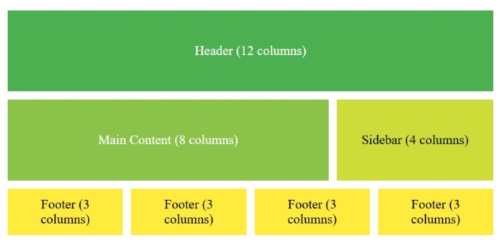
Example
Following code shows example of designing a responsive 12 column layout. Run this in Tutorialspoint HTML Compiler to see how layout changes with width.
<!DOCTYPE html>
<html lang="en">
<head>
    <title>12-Column Grid Layout</title>
    <style>
        /* Basic Grid Container Styling */
        .grid-container {
            display: grid;
            grid-template-columns: repeat(12, 1fr); /* 12 equal-width columns */
            gap: 10px; /* Space between items */
            padding: 10px;
        }

        /* Column Spans */
        .col-span-12 {
            grid-column: span 12;
            background-color: #4CAF50;
            color: white;
            padding: 20px;
            text-align: center;
        }

        .col-span-8 {
            grid-column: span 8;
            background-color: #8BC34A;
            color: white;
            padding: 20px;
            text-align: center;
        }

        .col-span-4 {
            grid-column: span 4;
            background-color: #CDDC39;
            color: white;
            padding: 20px;
            text-align: center;
        }

        .col-span-3 {
            grid-column: span 3;
            background-color: #FFEB3B;
            color: black;
            padding: 20px;
            text-align: center;
        }

        /* Responsive Adjustments */
        @media (max-width: 400px) {
            .col-span-8, .col-span-4, .col-span-3 {
                grid-column: span 12; /* Make all elements full-width on smaller screens */
            }
        }
    </style>
</head>
<body>

<div class="grid-container">
    <!-- Header -->
    <div class="col-span-12">Header (12 columns)</div>

    <!-- Main Content and Sidebar -->
    <div class="col-span-8">Main Content (8 columns)</div>
    <div class="col-span-4">Sidebar (4 columns)</div>

    <!-- Footer Links -->
    <div class="col-span-3">Footer Link 1 (3 columns)</div>
    <div class="col-span-3">Footer Link 2 (3 columns)</div>
    <div class="col-span-3">Footer Link 3 (3 columns)</div>
    <div class="col-span-3">Footer Link 4 (3 columns)</div>
</div>

</body>
</html>