- CSS - Home
- CSS - Roadmap
- CSS - Introduction
- CSS - Syntax
- CSS - Inclusion
- CSS - Types
- CSS - Measurement Units
- CSS - Selectors
- CSS - Colors
- CSS - Backgrounds
- CSS - Fonts
- CSS - Text
- CSS - Images
- CSS - Links
- CSS - Tables
- CSS - Borders
- CSS - Border Block
- CSS - Border Inline
- CSS - Margins
- CSS - Lists
- CSS - Padding
- CSS - Cursor
- CSS - Outlines
- CSS - Dimension
- CSS - Scrollbars
- CSS - Inline Block
- CSS - Dropdowns
- CSS - Visibility
- CSS - Overflow
- CSS - Clearfix
- CSS - Float
- CSS - Arrows
- CSS - Resize
- CSS - Quotes
- CSS - Order
- CSS - Position
- CSS - Hyphens
- CSS - Hover
- CSS - Display
- CSS - Focus
- CSS - Zoom
- CSS - Translate
- CSS - Height
- CSS - Hyphenate Character
- CSS - Width
- CSS - Opacity
- CSS - Z-Index
- CSS - Bottom
- CSS - Navbar
- CSS - Overlay
- CSS - Forms
- CSS - Align
- CSS - Icons
- CSS - Image Gallery
- CSS - Comments
- CSS - Loaders
- CSS - Attr Selectors
- CSS - Combinators
- CSS - Root
- CSS - Box Model
- CSS - Counters
- CSS - Clip
- CSS - Writing Mode
- CSS - Unicode-bidi
- CSS - min-content
- CSS - All
- CSS - Inset
- CSS - Isolation
- CSS - Overscroll
- CSS - Justify Items
- CSS - Justify Self
- CSS - Tab Size
- CSS - Pointer Events
- CSS - Place Content
- CSS - Place Items
- CSS - Place Self
- CSS - Max Block Size
- CSS - Min Block Size
- CSS - Mix Blend Mode
- CSS - Max Inline Size
- CSS - Min Inline Size
- CSS - Offset
- CSS - Accent Color
- CSS - User Select
- CSS - Cascading
- CSS - Universal Selectors
- CSS - ID Selectors
- CSS - Group Selectors
- CSS - Class Selectors
- CSS - Child Selectors
- CSS - Element Selectors
- CSS - Descendant Selectors
- CSS - General Sibling Selectors
- CSS - Adjacent Sibling Selectors
- CSS Advanced
- CSS - Grid
- CSS - Grid Layout
- CSS - Flexbox
- CSS - Visibility
- CSS - Positioning
- CSS - Layers
- CSS - Pseudo Classes
- CSS - Pseudo Elements
- CSS - @ Rules
- CSS - Text Effects
- CSS - Paged Media
- CSS - Printing
- CSS - Layouts
- CSS - Validations
- CSS - Image Sprites
- CSS - Important
- CSS - Data Types
- CSS3 Advanced Features
- CSS - Rounded Corner
- CSS - Border Images
- CSS - Multi Background
- CSS - Color
- CSS - Gradients
- CSS - Box Shadow
- CSS - Box Decoration Break
- CSS - Caret Color
- CSS - Text Shadow
- CSS - Text
- CSS - 2d transform
- CSS - 3d transform
- CSS - Transition
- CSS - Animation
- CSS - Multi columns
- CSS - Box Sizing
- CSS - Tooltips
- CSS - Buttons
- CSS - Pagination
- CSS - Variables
- CSS - Media Queries
- CSS - Functions
- CSS - Math Functions
- CSS - Masking
- CSS - Shapes
- CSS - Style Images
- CSS - Specificity
- CSS - Custom Properties
- CSS Responsive
- CSS RWD - Introduction
- CSS RWD - Viewport
- CSS RWD - Grid View
- CSS RWD - Media Queries
- CSS RWD - Images
- CSS RWD - Videos
- CSS RWD - Frameworks
- CSS References
- CSS Interview Questions
- CSS Online Quiz
- CSS Online Test
- CSS Mock Test
- CSS - Quick Guide
- CSS - Cheatsheet
- CSS - Properties References
- CSS - Functions References
- CSS - Color References
- CSS - Web Browser References
- CSS - Web Safe Fonts
- CSS - Units
- CSS - Animation
- CSS Resources
- CSS - Useful Resources
- CSS - Discussion
CSS RWD Images
In responsive web design, its important to make sure images fit well on all screen sizes and resolutions. By using properties like `max-width` and `min-width`, images can automatically resize to fit different screens. In this chapter, well learn how to make images responsive, look at key properties for responsive images, and see how to create a responsive image gallery.
When an image is uploaded to a webpage, it will be displayed in it's default width and height. We can change these dimensions in CSS so that the image fits according to available space in our layout. One of the popular approach to set image dimension, is to keep a fixed width for image (such 50% of screen or 25% of screen) and height will be set automatically according to aspect ratio of the image.
For better adaptability, we should always use relative units for the width property such as percentage, instead of absolute values, such as pixels. Absolute values restrict the image getting responsive.
Responsive Image Using width Property
To make an image scale according to screen size, we need to set width property of the image to 100% and height to auto.
img {
    width: 100%;
    height: auto;
}
Setting style in this way makes the image take up 100% of the width of its parent element, and the height will be adjusted to maintain the image's aspect ratio. This setup allows the image to scale with the screen size. However, on very large screens, the image may stretch beyond its natural width, making it appear distorted.
Example
In this example, the image displayed will scale according to screen size of output window. Run this code in Tutorialspoint HTML Compiler to adjust output window width and verify.
<!DOCTYPE html>
<html>

<head>
    <style>
        img {
            width: 100%;
            height: auto;
        }
    </style>
</head>

<body>
    <p>
        The image will cover 100% width
    </p>
    <img src="/css/images/border.png">
</body>

</html>
Responsive Image Using max-width Property
The above mentioned method has a drawback, on large screens the image will get stretched beyond it's natural dimension. To prevent this, we can use max-width property instead of 'width' property.
img {
    max-width: 100%;
    height: auto;
}
By setting image properties in this way, the image will scale down if it has to, but never scale up to be larger than its original size.
Example
In this example, the image displayed will scale according to screen size of output window but never scale more than it's natural size. Run this code in Tutorialspoint HTML Compiler to adjust output window width and verify.
<!DOCTYPE html>
<html>

<head>
    <style>
        img {
            max-width: 100%;
            height: auto;
        }
    </style>
</head>

<body>
    <p>
        The image will cover 100% width if natural width is less than
        output screen width
    </p>
    <img src="/css/images/border.png">
</body>

</html>
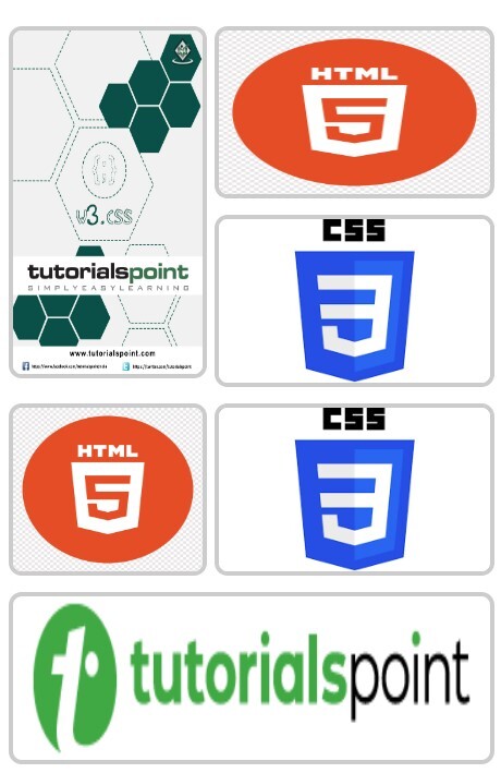
CSS Image Gallery
CSS Image Gallery is used to organize and display multiple images in responsive and visually appealing format. CSS properties can be used to control the layout of images, size, shape, spacing, spanning and lot of other visual effects.
CSS grid layout is most commonly used layout system for designing image gallery, with this we can align images in 2 dimensional manner.
Example
<!DOCTYPE html>
<html>

<head>
    <style>
        /* Gallery container */
        .gallery {
            display: grid;
            gap: 10px;
            padding: 10px;
            font-family: Arial, sans-serif;
        }

        /* style image items */
        .gallery img {
            width: 100%;
            height: 100px; /* Set a same height for all images */
            object-fit: fit;
            display: block;
            border-radius: 8px;
            border: 3px solid #ccc;
            transition: all 0.3s ease;
        }

        /* Spanning the first image across two rows */
        .gallery img:first-child {
            grid-row: span 2;
            height: 210px; /* Double the height of regular images */
        }

        /* Spanning the sixth image across two columns */
        .gallery img:nth-child(6) {
            grid-column: span 2;
        }

        /* Hover effect */
        .gallery img:hover {
            transform: scale(1.02);
            border-color: #555 ;
        }
    </style>
</head>

<body>
    <div class="gallery">
        <img src="/w3css/images/w3css_pdfcover.jpg" alt="Gallery Image 1">
        <img src="/css/images/html.png" alt="Gallery Image 2">
        <img src="/css/images/css.png" alt="Gallery Image 3">
        <img src="/css/images/html.png" alt="Gallery Image 4">
        <img src="/css/images/css.png" alt="Gallery Image 5">
        <img src="/html/images/logo.png" alt="Gallery Image 6">
    </div>
</body>

</html>
Responsive Image Gallery
We can use CSS media queries to create a responsive image gallery that scales and rearranges its content based on the screen width. Following is simple media query that define number of column is image gallery for large screen and small screen.
/* 4 columns in case of large screen */
@media (min-width: 600px) {
    .gallery {
        grid-template-columns: repeat(4, 1fr);
    }
}

/* 1 column in case of small screen */
@media (max-width: 599px) {
    .gallery {
        grid-template-columns: 1fr;
    }
}
With media queries we can also define style for specific orientation (landscape or portrait) of user device. The default value for this is portrait.
Example
This is example of designing a responsive image gallery.
<!DOCTYPE html>
<html>

<head>
    <style>
        /* Gallery container */
        .gallery {
            display: grid;
            gap: 10px;
            padding: 10px;
            font-family: Arial, sans-serif;
        }

        /* 4 columns in case of large screen */
        @media (min-width: 600px) {
            .gallery {
                grid-template-columns: repeat(4, 1fr);
            }
        }

        /* 1 column in case of small screen */
        @media (max-width: 599px) {
            .gallery {
                grid-template-columns: 1fr;
            }
        }

        /* Individual image items */
        .gallery img {
            width: 100%;
            height: 100px; /* Set a same height for all images */
            object-fit: fit; /* Ensure images fits the area */
            display: block;
            border-radius: 8px;
            border: 3px solid #ccc; /* Default border color */
            transition: all 0.3s ease;
        }

        /* Spanning the first image across two rows */
        .gallery img:first-child {
            grid-row: span 2;
            height: 210px; /* Double the height of regular images */
        }

        /* Spanning the sixth image across two columns */
        .gallery img:nth-child(6) {
            grid-column: span 2;
        }

        /* Hover effect */
        .gallery img:hover {
            transform: scale(1.02);
            border-color: #555 ;
        }
    </style>
</head>

<body>
    <div class="gallery">
        <img src="/w3css/images/w3css_pdfcover.jpg" alt="Gallery Image 1">
        <img src="/css/images/html.png" alt="Gallery Image 2">
        <img src="/css/images/css.png" alt="Gallery Image 3">
        <img src="/css/images/html.png" alt="Gallery Image 4">
        <img src="/css/images/css.png" alt="Gallery Image 5">
        <img src="/html/images/logo.png" alt="Gallery Image 6">
    </div>
</body>

</html>
Output for large screens:
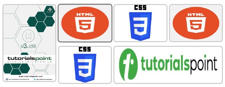
Output for small screens: